Mapping and research to comprehensively measure child vulnerability worldwide
Humanity is on the move. Driven from their rural homes by conflict and climate change, people are heading to the cities in a mass migration that is changing the landscape of poverty. Today the world’s most vulnerable children aren’t just in remote villages or active war zones. Increasingly, they are hidden in places you won’t hear about on the news.
In September 2022, World Vision International and the Institute of Economics and Peace (IEP) began an innovative project to track, compare and visualize a variety of child vulnerability measures across the world. This initiative forms part of World Vision’s ongoing effort to enhance the scope, targeting and impact of its humanitarian, development, advocacy and peacebuilding programming, particularly in relation to the quadruple threat of urban fragility, climate change, gender inequality and social exclusion.
To date, we have consolidated globally comparable national and subnational datasets and visualized them through a series of maps. The result of this work and the methodology used to create them are shared below. Much work remains to be done and there is much more to be unpacked, including an analysis of correlations and trends and the inclusion of more data sets. There is currently no index or analysis with global coverage focused on creating a multidimensional view of child vulnerability. As such, we believe this ongoing work can be of important value to the humanitarian and development community and can have a deep impact on the way multidimensional child vulnerability is understood and addressed over time. We hope you find these maps informative and welcome participation in future conversations related to this important work.
To learn more, contact: Aline Rahbany, Technical Director, Urban Programming
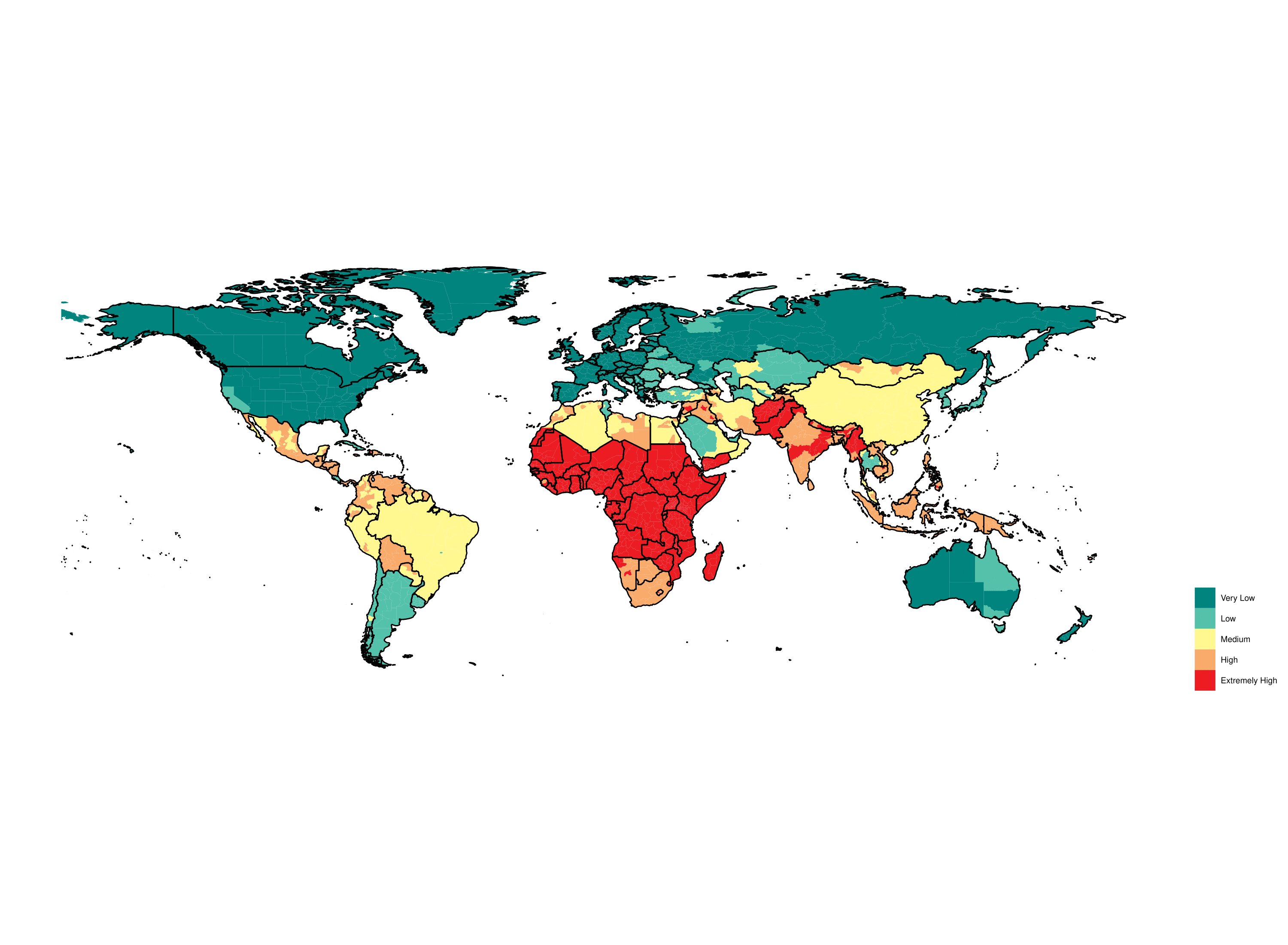
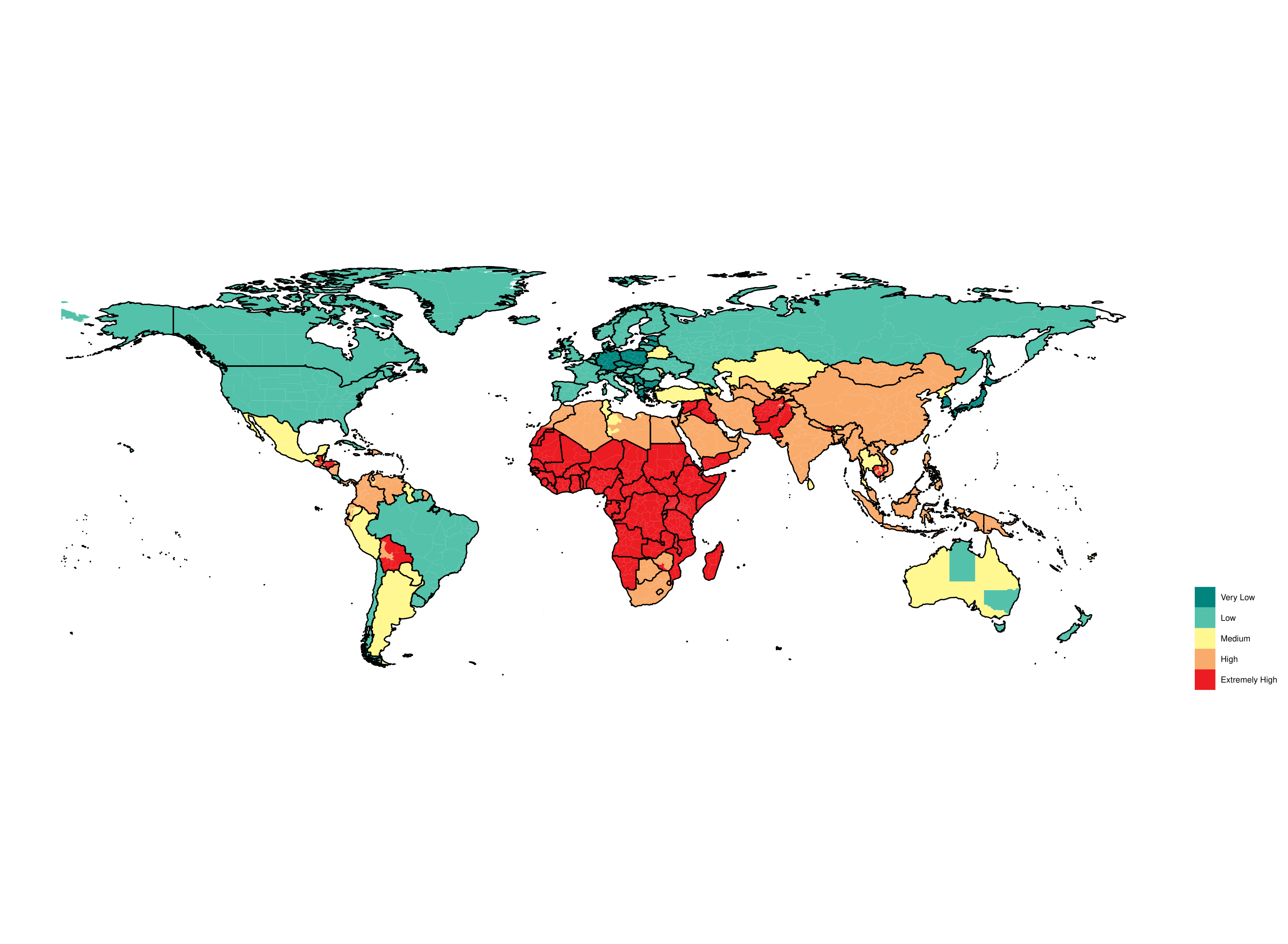
Map 1: An overview of CHILD DEPRIVATION WORLDWIDE, considering child mortality rates, child poverty, the prevalence of underweight children under 5 and broader forms of food insecurity and water stress that impact children.


Sources: UNICEF, WHO, World Bank, IEP Calculations
Sources: UNICEF, WHO, World Bank, IEP Calculations
Average levels of child vulnerability on the African continent are extremely high when compared to the rest of the world. This can lead to little differentiation between African countries on some of the maps presented here. To highlight this, a more detailed map for the region has been generated, re-banding scores in a way that emphasizes the diversity that exists when looked at in a more granular way. One core aim of the next phase of the project is to create equally detailed and comparable maps for all regions of the world.
Map 1.1: Overview of CHILD DEPRIVATION IN AFRICA, using indicators from the same sources listed above but re-banded to obtain higher levels of national and subnational differentiation. Sub-Saharan Africa has the highest prevalence of food insecurity globally with 66% of the population deemed food insecure. Interestingly, both globally and in Africa, stunting for children under five years old is more common in males than females. In some countries in sub-Saharan Africa, thinness is three times as prevalent in males as in females in the 5-19 age bracket (IEP Ecological Threat Report 2021).

Sources: UNICEF, WHO, World Bank, IEP Calculations
Sources: UNICEF, WHO, World Bank, IEP Calculations
Please note that the value given to the colour scheme on Africa-specific maps cannot be compared to the global maps. For example, “Green” Gabon or South Africa on this regional map become red and orange when globally compared. The aim of the regional map is therefore to simply emphasize the variety and potential operational value of a more detailed mapping and analysis exercise in the future.
Map 2: An overview of CHILDREN’S VULNERABILITY TO NATURAL HAZARDS. The map considers the aggregate number of disasters from 2000 to 2018 weighted by mortality over the same period. Climate-induced disasters such as sea level rise as well as pollution and contamination are all elements that can be considered in future more detailed mapping and analysis exercises. Notwithstanding, the food and water security indicators included in other domains are intrinsically impacted by climate change and therefore climate change can be considered accounted for in the maps to a degree.
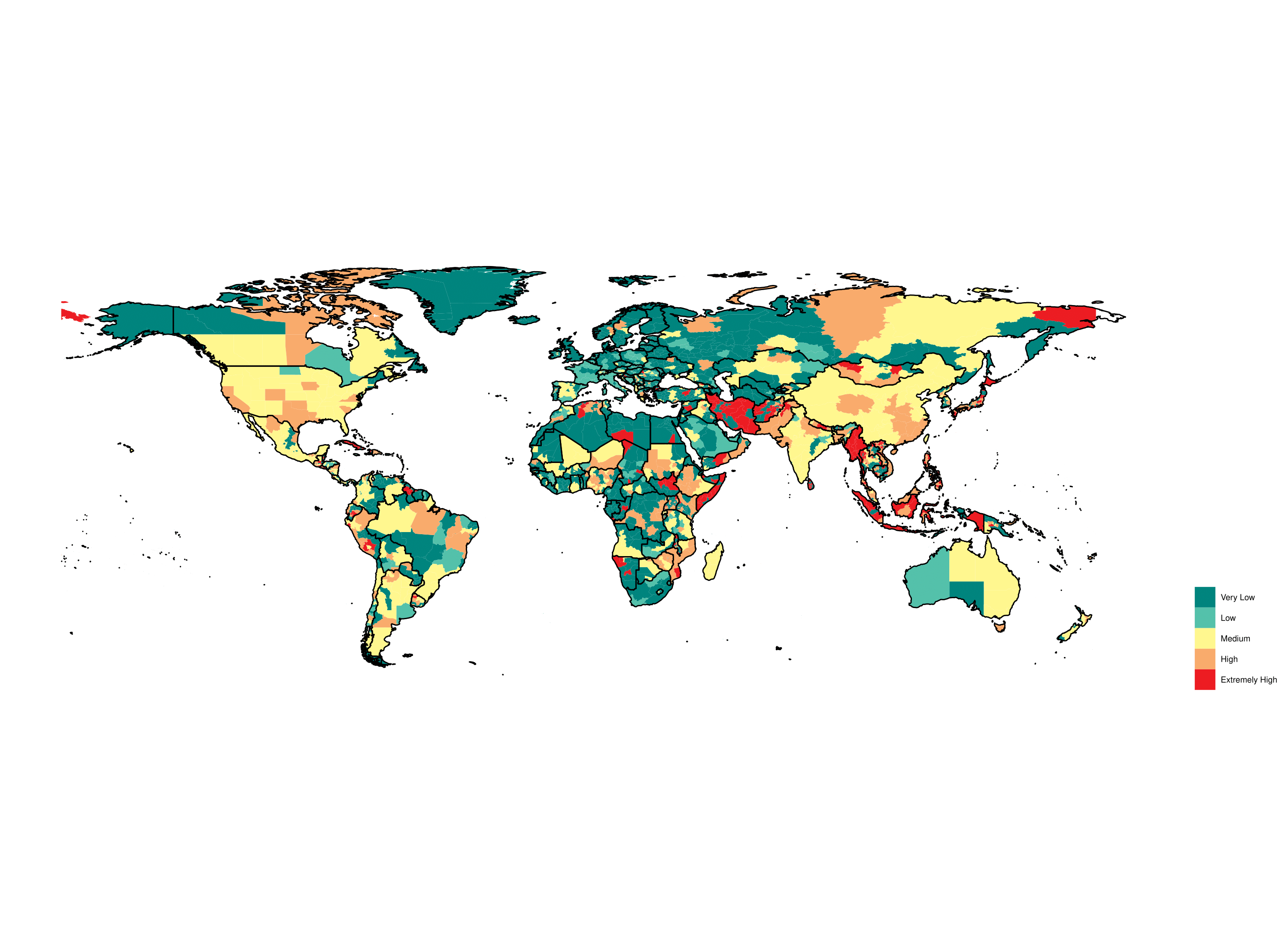

Sources: GDIS, EMDAT, GBD, IEP Calculations
Sources: GDIS, EMDAT, GBD, IEP Calculations
Map 2.2: Overview of CHILDREN’S VULNERABILITY TO NATURAL HAZARDS IN AFRICA, using indicators from the same sources listed above but re-banded to obtain higher levels of differentiation nationally and sub-nationally. Exposure to natural hazards and exposure to violence are the most granular of the domains selected for the project to date, this is evidenced by the relatively few differences in colour coding between global and regional maps for both domains.

Sources: GDIS, EMDAT, GBD, IEP Calculations
Sources: GDIS, EMDAT, GBD, IEP Calculations
Map 3: An overview of EXTREME DISCRIMINATION between boys and girls, considering gender-differentiated measures of schooling, literacy-numeracy, physical and social-emotional development and learning, as well as the completeness of birth registration. The colour palette represents the degree to which there is a difference between the way girls and boys are treated. The selected indicators help highlight the degree to which girls suffer discrimination, particularly but by no means limited to the field of education.

Sources: World Bank, WHO, UNICEF, IEP Calculations
Sources: World Bank, WHO, UNICEF, IEP Calculations
Map 3.1: Overview of EXTREME DISCRIMINATION IN AFRICA, using indicators from the same sources listed above but re-banded to obtain higher levels of differentiation nationally and sub-nationally.

Sources: World Bank, WHO, UNICEF, IEP Calculations
Sources: World Bank, WHO, UNICEF, IEP Calculations
Map 4: Overview of CHILDREN’S EXPOSURE TO VIOLENCE, considering armed clashes and terrorist incidents. While children are exposed to multiple forms of violence, including sexual violence, family-based violence and bullying, tracking these remains challenging due to underreporting, lack of investment, cultural norms and the frequent invisibility of violence against children. This map nonetheless helps track rapid increases in children’s exposure to violence and highlights areas where instability is likely aggravating if not exponentially increasing children’s exposure to all the forms of violence discussed above.

Sources: ACLED, Terrorism Tracker, IEP Calculations
Sources: ACLED, Terrorism Tracker, IEP Calculations
Map 4.1: Overview of CHILDREN’S EXPOSURE TO VIOLENCE IN AFRICA, using indicators from the same sources listed above but re-banded to obtain higher levels of differentiation nationally and sub-nationally. Terrorism in Africa and particularly sub-Saharan Africa has increased greatly over the past decade. A close correlation exists between conflict and terrorism around the world, and both can lead to extensive displacement. UNICEF estimates that over 36 million children worldwide had been displaced because of conflict and violence as of the end of 2021.

Sources: ACLED, Terrorism Tracker, IEP Calculations
Sources: ACLED, Terrorism Tracker, IEP Calculations
Map 5: Overview of levels of RAPID URBANIZATION, considering the estimated number of children living in slum households and annual urban population growth. The 15 countries projected to record the highest percentage increase in their populations are all located in sub-Saharan Africa. (IEP Ecological Threat Report 2021)

Sources: UN-HABITAT, World Bank, IEP Calculations
Sources: UN-HABITAT, World Bank, IEP Calculations
Map 5.1: Overview of levels of RAPID URBANIZATION IN AFRICA, using indicators from the same sources listed above. Africa is experiencing significant population growth and megacities on the continent will likely struggle to deliver the new infrastructure and services needed over the next 25 years. This will likely lead to the expansion of slums and a furtherance of the hazardous and unhealthy conditions already present in some. This is aggravated by the fact that many rapidly growing countries also have low levels of Peace. Niger for example is 140th in the Global Peace Index and its population is expected to grow by 184% by 2050.

Sources: UN-HABITAT, World Bank, IEP Calculations
Sources: UN-HABITAT, World Bank, IEP Calculations
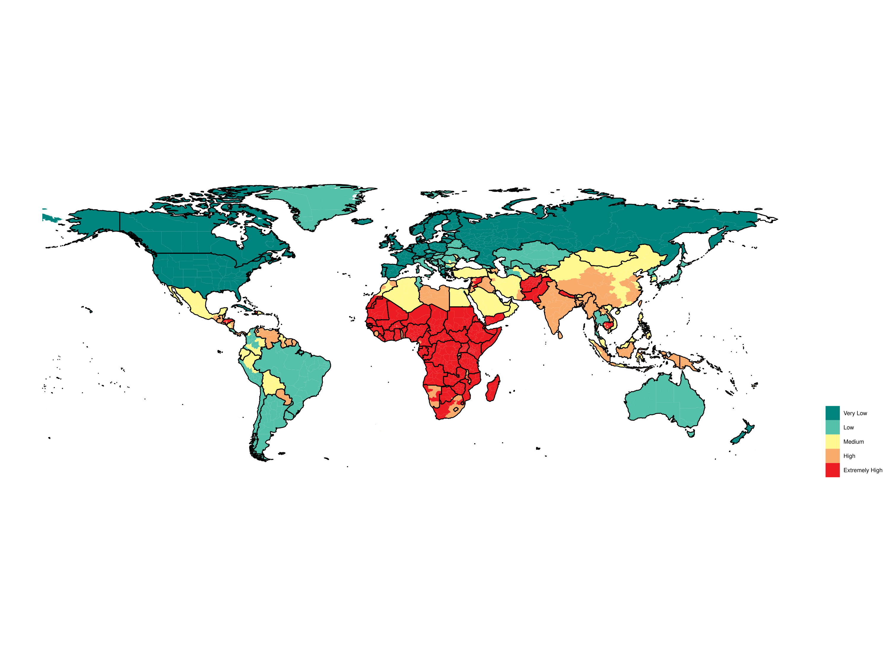
Map 6: An overview of MULTIDIMENSIONAL CHILD VULNERABILITY WORLDWIDE, incorporating the full set of selected indicators and domains included in the pilot study.


Sources: UNICEF, WHO, World Bank, UNDP, ACLED, Terrorism Tracker, UN-HABITAT, IEP Calculations
Sources: UNICEF, WHO, World Bank, UNDP, ACLED, Terrorism Tracker, UN-HABITAT, IEP Calculations
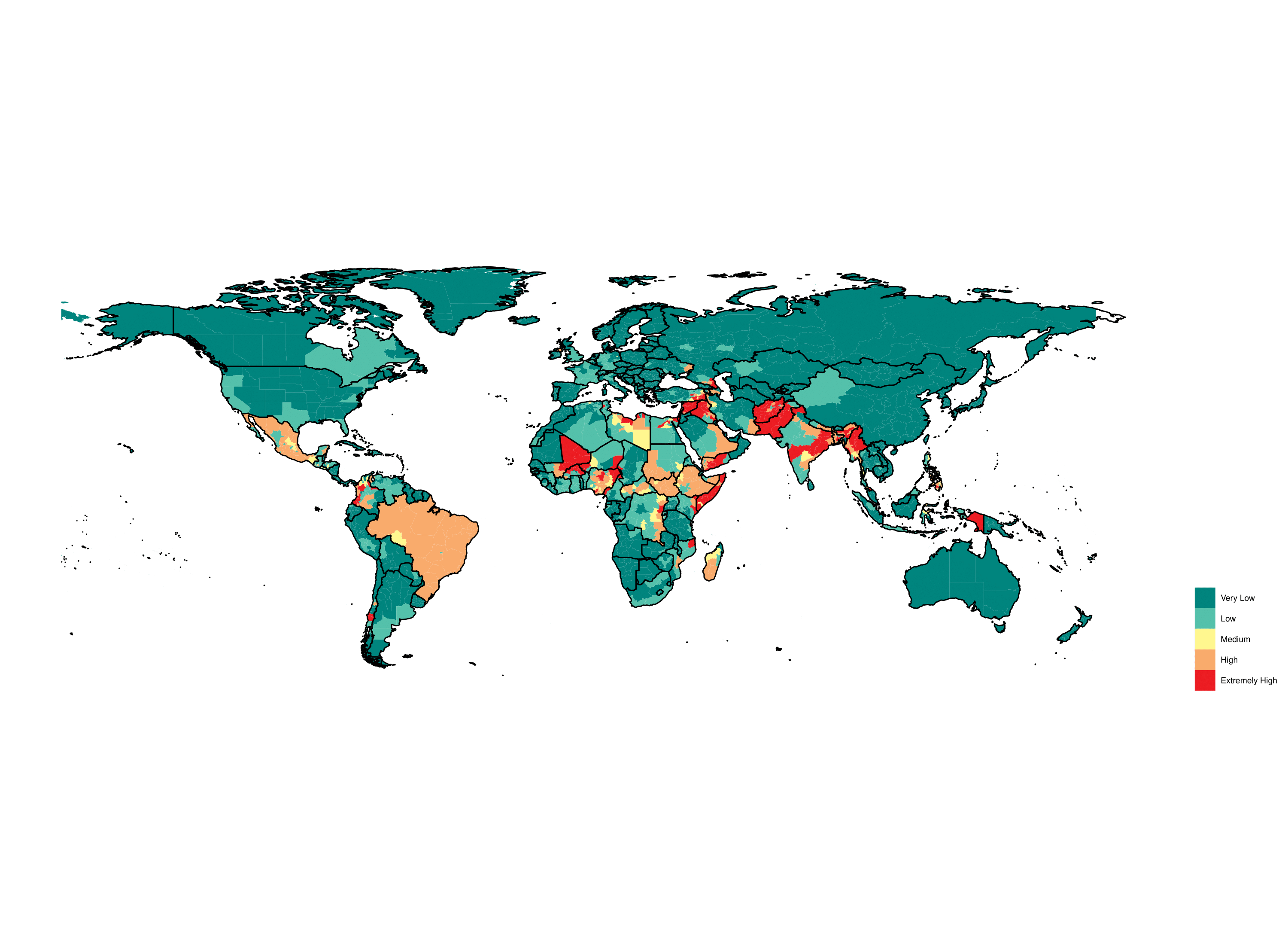
Map 6.1: Overview of MULTIDIMENSIONAL CHILD VULNERABILITY IN AFRICA, re-banded using indicators from the same sources listed above.

Sources: UNICEF, WHO, World Bank, UNDP, ACLED Terrorism Tracker, UN-HABITAT, IEP Calculations
Sources: UNICEF, WHO, World Bank, UNDP, ACLED Terrorism Tracker, UN-HABITAT, IEP Calculations
METHODOLOGY
Open source and subscription data (some covering up to 228 countries and 3,000 administrative units) were reviewed and sixteen indicators were selected ensuring coverage across 5 core domains: extreme deprivation, extreme discrimination (currently limited to gender), urbanization, vulnerability to natural hazards and conflict. These domains, based on the 4 dimensions of child vulnerability described in WVI’s Integrated Programming Model were adapted to strongly intersect with those defined as “the quadruple threat” (urban fragility, climate change, gender inequality and social exclusion). Conflict was also factored in given its role as an exacerbator of all the above. The table below provides an overview of the indicators selected per domain with their corresponding source.
|
DOMAINS |
INDICATOR |
SOURCE |
|
Extreme Deprivation |
Prevalence of underweight, weight for age (% of children under 5) |
UNICEF, WHO, World Bank |
|
Food Insecurity |
EIU Food Security Index, Gallup World Poll, IEP |
|
|
Water Risk |
World Resources Institute, IEP |
|
|
Multidimensional poverty headcount ratio, children (% of population ages 0-17) |
World Bank |
|
|
Under five mortality rate - median estimate per 1,000 live births |
UNICEF |
|
|
Mortality rate attributed to unsafe water, unsafe sanitation, and lack of hygiene (per 100,000 population) |
WHO |
|
|
Vulnerability to Disasters |
Natural Hazards |
The Geocoded Disasters Dataset, Centre for Research on the epidemiology of Disaster’ Emergency Events Database (EM-DAT) |
|
Extreme Discrimination |
GDL Expected years schooling girls’ data |
UNDP |
|
Children out of school, female (% of primary school age) |
World Bank World Development Indicators |
|
|
Proportion of female children aged 36−59 months who are developmentally on track in at least three of the following domains: literacy-numeracy, physical development, social-emotional development, and learning (% of children aged 36-59 months) |
WHO |
|
|
Completeness of birth registration, female (%) |
UNICEF |
|
|
Exposure to Violence - Terrorism and Conflict |
Armed clash – incident |
ACLED |
|
|
Terrorism Tracker |
|
|
Urbanization |
Children living in slum households |
UN-Habitat |
|
Urban population growth (annual %) |
World Bank Development Indicators |
|
|
Population Increase 2020-2050 |
Gao, J. 2020. Global 1-km Downscaled Population Base Year and Projection Grids Based on the Shared Socioeconomic Pathways, Socioeconomic Data and Applications Center (SEDAC). |
Once the indicators were chosen, the data was collected and cleaned. In instances where subnational data was not available, country-level data was used. Each indicator value was banded and given a score based on the rubric below. Indicator banding was bracketed by the highest and lowest measure for each.
a. 1 = Very Low
b. 2 = Low
c. 3 = Medium
d. 4 = High
e. 5 = Very High
Subnational indicator datasets were combined into domains datasets. This was then used to create a subnational domain score. Each indicator was equally weighted. A map was then generated for each domain, with red indicating a score of 5 and green indicating a score of 1. Once each domain score was calculated and mapped, a composite score for each administrative unit was calculated. This was used to create the composite maps.